7.3 Data analysis
Before starting to build any model it is good practice to analyze the data. Data analysis is done in two inter-linked steps, exploratory and quantitative data analysis and therefore can be viewed together.
Exploratory data analysis
- Find correlations or mutial depence
- Quantiative analysis
- Check distribution
- Long tail => log of variable
- Check distribution
Why data analysis?
- Understanding characteristic and distribution of response
- histogram
- box plot
- Uncover relationships between predictors and response
- scatter plots
- pairwise correlation plot among predictors
- projection of high-dimensional predictors into lower dimensional space
- heat maps across predictors
The process of exploratory and quantitative data analysis is described in detail in the following example.
7.3.1 Example for exploratory and quantitative data analysis
This example is from the online book “Feature Engineering and Selection: A Practical Approach for Predictive Models” (Kuhn and Johnson 2018)
7.3.1.1 Visualization for numeric data
In this example the data set on ridership on the Chicago Transit Authority (CTA) “L” train system http://bit.ly/FES-Chicago is used to predict the ridership in order to optimize operation of the train system.
Task: predict future ridership volume 14 days in advance
Source: Wikimedia Commons, Creative Commons license
Since for any prediction of future ridership volume only historical values are available lagging data are used. In this case a lag of 14 days are used, i.e. ridership at day D-14.
Distribution of response
The distribution of the response gives an indication what to expect from a model. The residuals of a model should have less variation than the variation of the response.
If the distribution shows that the frequency of response decreases proportionally with larger values this might be an indication that the response follows a log-normal distribution. Log-transforming the response would induce a normal distribution and often will enable a model to have better prediction performance.
Why look at distribution?

- Gives indication on what to be expected from model performance
- variance of residuals < variance of response
- Distribution shaping might enable better prediction performance
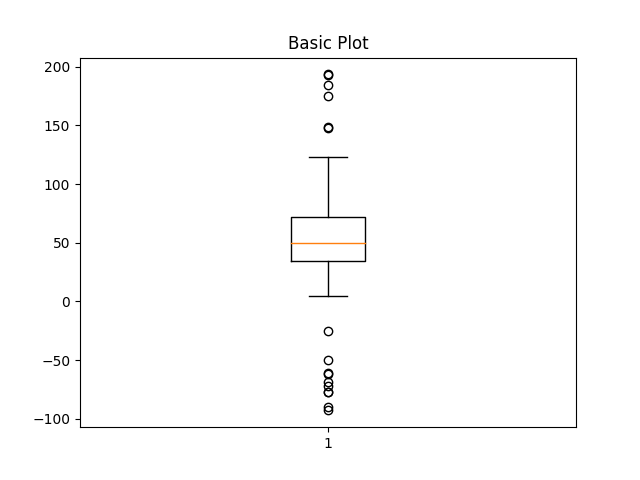
A box plot gives a quick idea of the distribution of a variable

Figure from (Kuhn and Johnson 2018)
Box plot legend:
- Vertical line
- median of data
- Blue area
- represents 50% of data
- Whiskers
- indicate upper and lower 25% of data
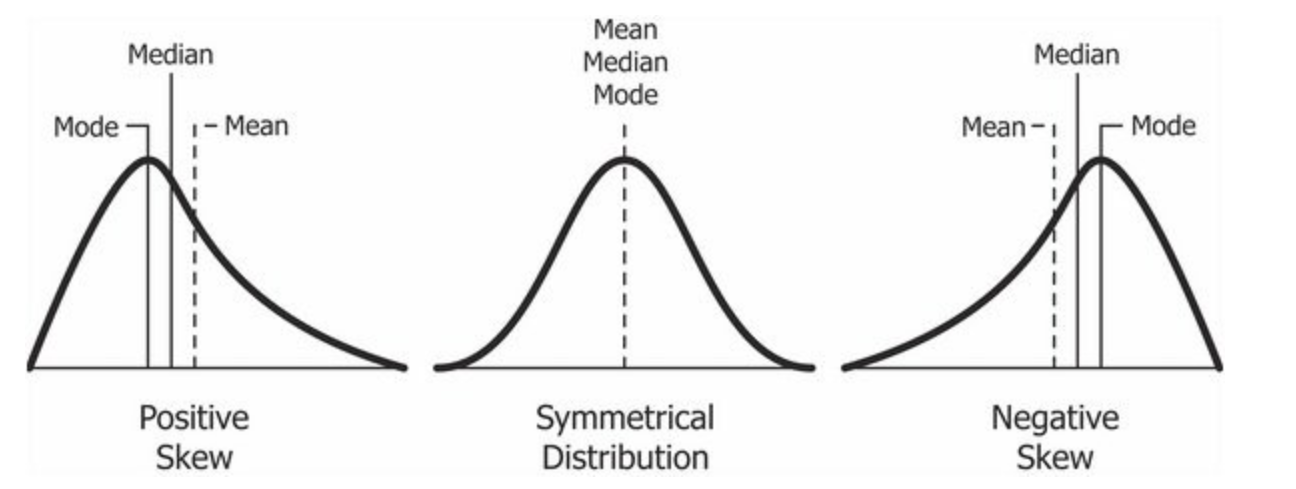
Skewness of distribution
In the following picture the relative position of the red line within its surrounding box shows the skewness of the data
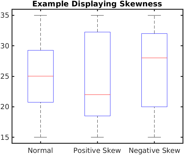
What the skewness of data means for its distribution is shown in the picture below
mode: Value which appears most often in data set
The box plot doesn’t show if there are multiple peaks or modes. Histograms and violin plots are better suited in that case

Figure from (Kuhn and Johnson 2018)
Box plot alternatives:
To compare multiple distributions box plots are still helpful as shown in the next image which shows the distribution of weekday ridership at all stations
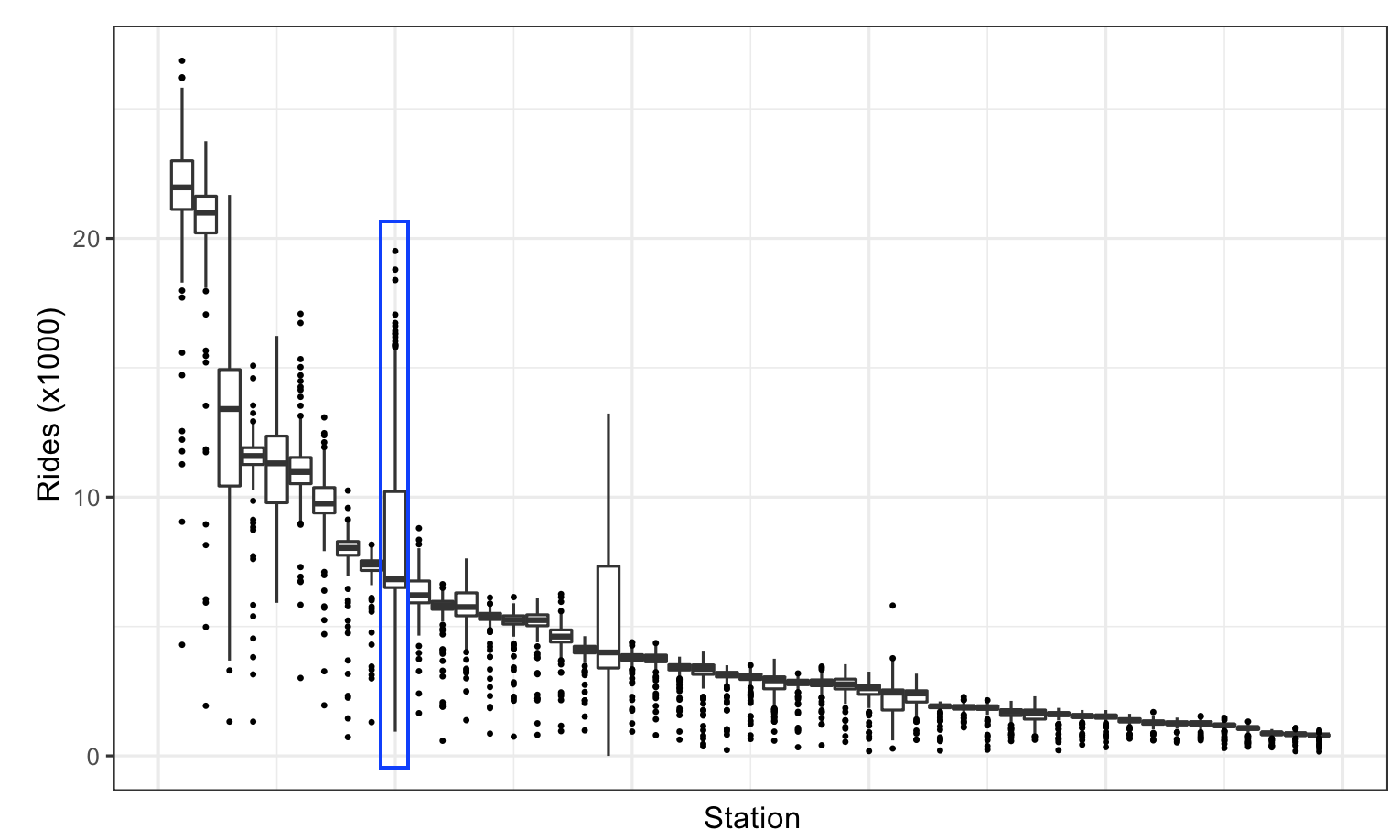
Figure from (Kuhn and Johnson 2018)
Knowledge gained through box plot:
- Wider distribution than other stations
- Station is close to stadium of Chicago Clubs
- \(\implies\) Clubs home game schedule would be important information for model
Using faceting and colors to augment visualizations
Facets create the same type of plots and splitting the plot into different panels based on some variable
Faceting:
- Same type of plot
- Based on some variable
- Below faceting shows that ridership is different for parts of the week
- \(\implies\) part of the week is important feature
The plot below shows the ridership for Clark/Lake, and gives an explanation for the two modes seen in the histogram above, the ridership is vastly different on weekends than during the week.
Figure from (Kuhn and Johnson 2018)
Scatter plots
Scatter plots can add a new dimesions to the analysis
Scatter plot:
- One variable on x-axis, the other variable on y-axis
- Each sample plotted in this coordinate space
- Assess relationships
- between predictors
- between response and predictors

Figure from (Kuhn and Johnson 2018)
There are several conclusions which can be drawn from the scatter plot above
Knowledge gained through scatter plot:
- Strong linear relationship between 14-day lag and current-day ridership
- Two distinct groups of points
- weekday
- weekend
- Plenty of outlier
- Uncovering explanation of outlier \(\implies\) new useful feature
Heatmaps
Heatmaps are a versatile plots that displays one predictor on the x-axis and another predictor on the y-axis. Both predictors must be able to be categorized. The categorized predictors form a grid, this grid is filled by another variable.
Heatmaps:
- Categorize predictor
- for x and y-axis
- Display another variable on grid
- categorical or continuous
- Color depends on either value or category
The following heatmap investigates the all cases of weekday ridership less than 10,000. Those represent outlier needing explanation
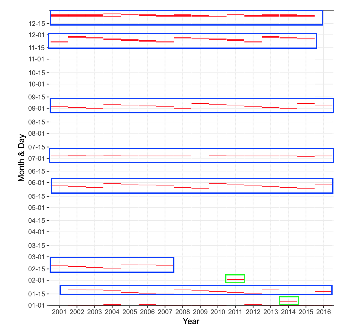
Figure from (Kuhn and Johnson 2018)
blue: holiday
green: extreme weather
Heatmap concept
- Categorize predictor
- x-axis: represents year
- y-axis: represents month and day
- Red lines indicate weekdays ridership < 10,000
- Blue boxes mark holiday seasons
- Green boxes mark unusual data points
- both days hat extreme weather
- \(\implies\) weather is important feature
Correlation matrix plots
An extension to scatter plot correlation matrix plots show the correlation between each pair of variable.
Correlation matrix plots
- Extension to scatter plot
- Each variable is represented on the outer x-axis and outer y-axis
- Matrix colored based on correlation value
Interactive figure based on (Kuhn and Johnson 2018)
Knowledge gained through analysis of correlation matrix plot
- Ridership across station is positively correlated for nearly all pairs of stations
- Correlation for majority of stations is extremely high
- information present across stations is redundant
- Columns and rows are organized based on hierarchical cluster analysis
- stations that have similar correlation vectors will be nearby on the axis
- helps to identify groups \(\implies\) may point to important features
Principal Components Analysis (PCA)
One way of condensing many dimensions into just two or three are dimension reductions techniques such as principle components analysis (PCA). An explanation of dimension reductions techniques is given in chapter 7.4.2.3
Principal components analysis finds combinations of the variables that best summarizes the variability in the original data
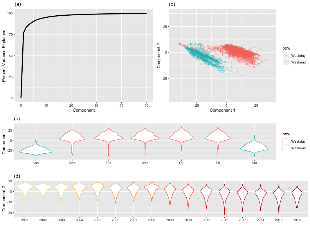
Figure from (Kuhn and Johnson 2018)
Knowledge gained through analysis of PCA plot
- Component 1 focuses on part of the week
- Component 2 focuses on changes over time
7.3.2 Visualizations for Categorical Data: Exploring the OkCupid Data
OkCupid is an online dating platform. A data set of 50,000 San Francisco user data is available at GitHub
Data of OkCupid data set:
- open text essays related to an individual’s interests and personal descriptions,
- single-choice type fields such as profession, diet, and education, and
- multiple-choice fields such as languages spoken and fluency in programming languages.
Task: Predict whether the profile’s author was worked in STEM (science, technology, engineering, and math) field
7.3.2.1 Visualizing Relationships between Outcomes and Predictors
To find out whether religion would be a good predictor several kinds of plots are compared.
Firstly use a bar plot. The figure is ordered from greatest ratio (left) to least ratio (right) of STEM members in that religion.
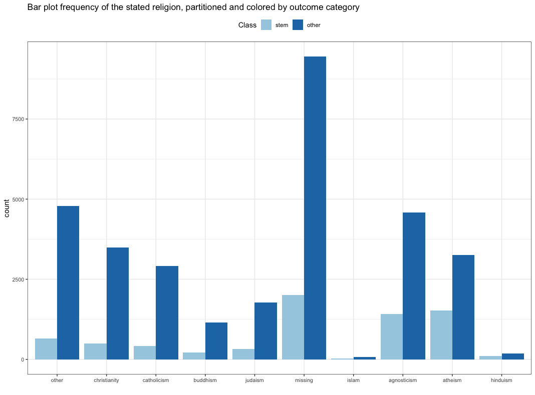
Figure from (Kuhn and Johnson 2018)
Bar plot shortcomings:
- Doesn’t easily show ratio
- see Hinduism
- Gives no sense on uncertainty
- number of profiles per religion
- the smaller the number the higher the uncertainty
A better alternative is a stacked bar plot as shown in the next graph
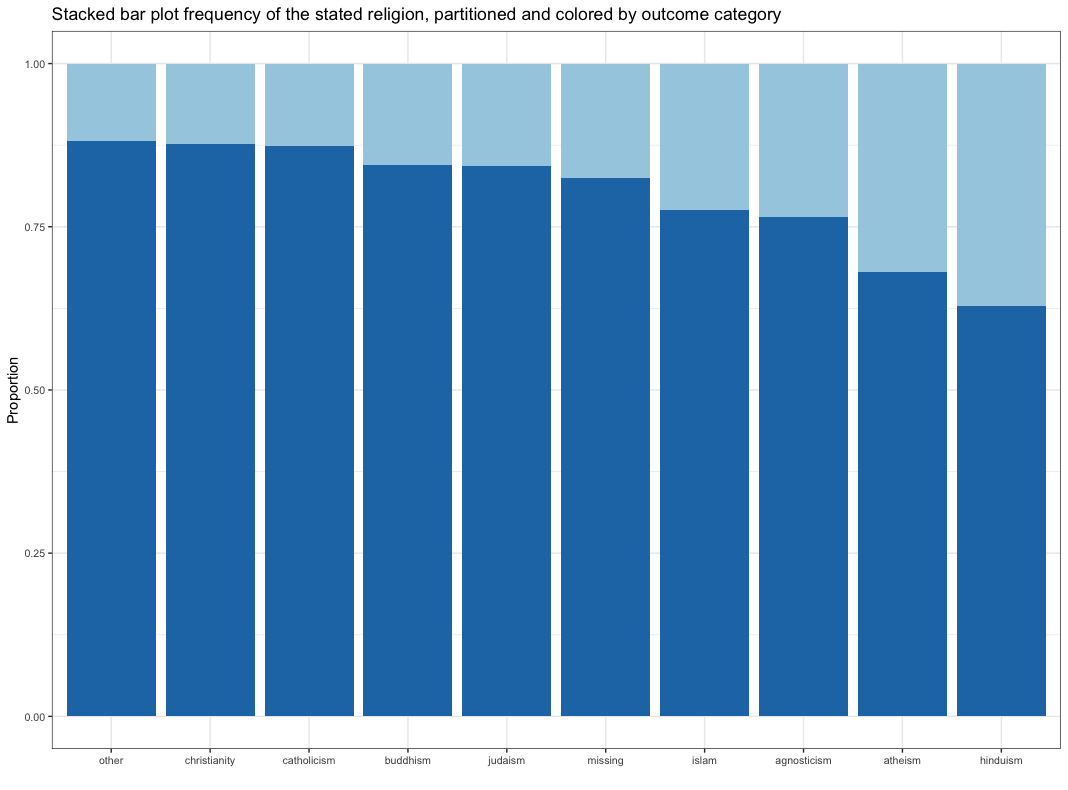
Figure from (Kuhn and Johnson 2018)
Stacked plot shortcomings:
- No sense of frequency
- No information that there are very few Islamic profiles
- No sense of uncertainty
A better alternative is a error bar plot as shown in the next graph
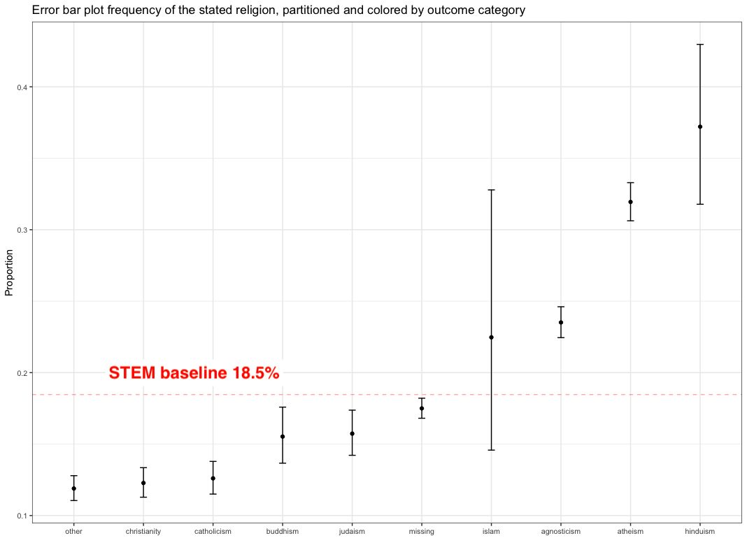
Figure from (Kuhn and Johnson 2018)
Error bar plot:
- Shows uncertainty
- 95% confidence level 18
All plots combined are shown below
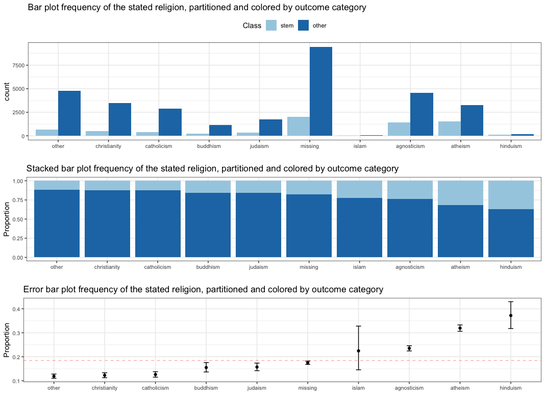
Figure from (Kuhn and Johnson 2018)
each graph should have a clearly defined hypothesis and that this hypothesis is shown concisely in a way that allows the reader to make quick and informative judgments based on the data
Conclusion:
- Each graph should have clearly defined hypothesis
- Hypothesis shall be shown clearly
- Reader can make quick, informative judgments based on data
- \(\implies\) Religion is a useful feature
Relationship between a categorical outcome and a numeric predictor
As an example the relationship between essay length and STEM and others are analyzed using a histogram as shown below

Figure from (Kuhn and Johnson 2018)
The histogram shows that the distribution is pretty similar between STEM and others. A way to check whether the predictor could be useful is to train a logistic regression an a basis expansion by building a regression spline smoother of the essay length.
Conclusion:
- Distribution similar for STEM and others
- Train logisitc regression model on basis expanded essay length
- Values are close to base rate of 18.5%
- \(\implies\) essay length is NOT a helpful feature
References
lower quarter of the data↩︎
higher quarter of the data↩︎
In statistics, a binomial proportion confidence interval is a confidence interval for the probability of success calculated from the outcome of a series of success–failure experiments (Bernoulli trials). In other words, a binomial proportion confidence interval is an interval estimate of a success probability \(p\) when only the number of experiments \(n\) and the number of successes \(n_S\) are known.↩︎